Dashboards & Graphs
RunReveal's dashboard system enables you to create custom visualizations of your security data using SQL queries against your ClickHouse tables. Build dashboards that surface critical insights and track key metrics in real-time.
Getting Started: Navigate to Dashboards → Graphs to create your first visualization, or go directly to Dashboards → Create Layout to build a complete dashboard.
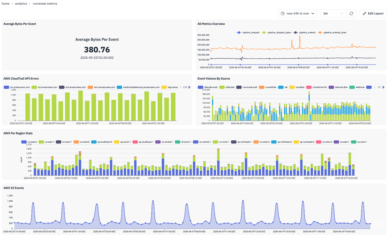
Dashboard Components
Your RunReveal dashboards consist of three hierarchical components:
- Graphs — Individual visualizations powered by SQL queries.
- Panels — Containers that hold and size your graphs.
- Dashboard Layouts — The overall arrangement of panels.
Available Visualization Types
Time-Based Visualizations
Line Chart
- Best for continuous trends over time
- Shows changes in metrics like event rates, response times
- Supports multiple data series
Area Chart
- Renders as a filled line for volume trends
- Useful for cumulative or stacked metrics over time
Column Chart
- Perfect for time-bucketed data
- Compares values across time periods
- Supports stacking for multi-series data
Creating Graphs
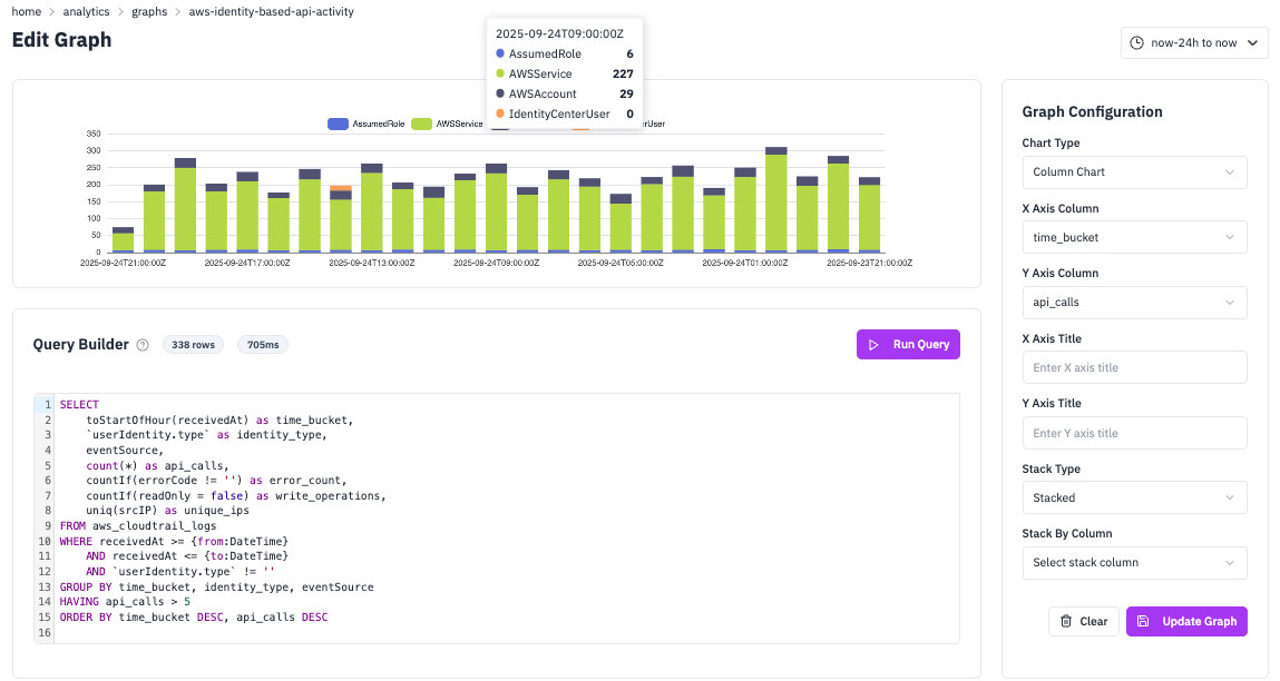
1) Navigate to Graph Creation
Go to Dashboards → Graphs → Create Graph or click the edit layout button on an existing dashboard.
2) Write Your SQL Query
Use RunReveal's query parameters for dynamic time ranges:
Available Parameters
{from:DateTime}— Start time from the time picker{to:DateTime}— End time from the time picker (inclusive){interval:Int64}— Time interval in seconds (auto-calculated)
Custom Parameters
You can define your own parameters using the same {paramName:Type} syntax. Any parameter in your query that isn't from, to, or interval will automatically appear in a collapsible PARAMS bar at the top of your dashboard.
When you view a dashboard with this query, you'll see input fields for environment and region that let you dynamically filter all panels. Previously entered values are saved for quick re-selection.
3) Configure Visualization
- Chart Type: Select from supported types (Line, Column, Area, Bar, Pie, KPI; Scatter optional).
- X Axis Column: Choose your X-axis data column.
- Y Axis Column: Choose your Y-axis data column.
- Stack Column: (Optional) Column for data stacking.
- Axis Titles: Add descriptive labels.
4) Test and Save
Click Run Query to preview your visualization, adjust as needed, then save with a descriptive name.
Creating Dashboards
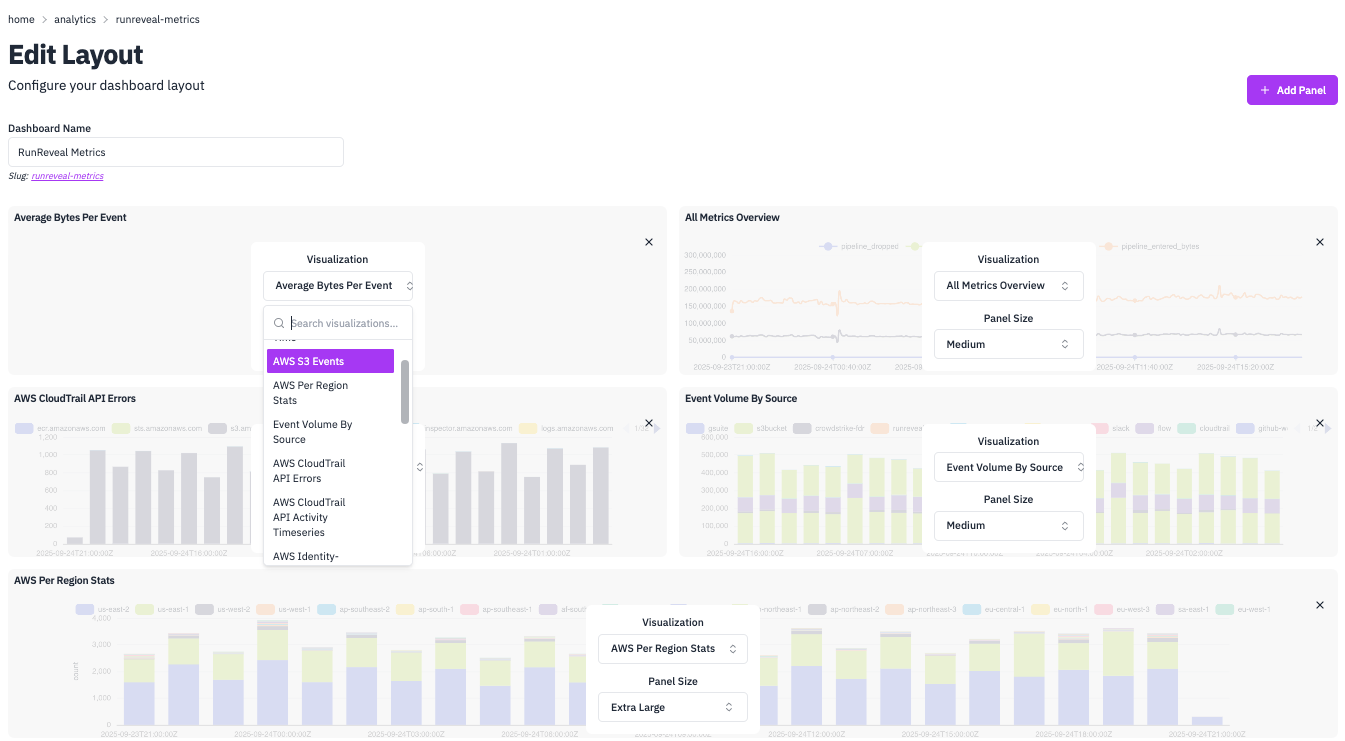
1) Create Dashboard Layout
Navigate to Dashboards → Create Layout and provide a Dashboard Name.
2) Add Panels
Click Add Panel to create visualization containers. Choose from panel sizes:
xs— Extra smallsm— Smallmd— Mediumlg— Largexl— Extra large
3) Assign Graphs to Panels
- Select existing graphs from the dropdown.
- Or create new graphs directly in the panel editor.
- Configure panel-specific settings.
4) Arrange and Save
Panels automatically arrange in a responsive grid. Save your dashboard when complete.
Stacking Options
Control how multi-series data is displayed:
| Stack Type | Description | Use Case |
|---|---|---|
| Default/None | Series rendered independently | Compare absolute values |
| Stacked | Series add on top of each other | See cumulative totals |
| Stacked 100% | Normalized to 100% | Compare proportions over time |
Stacking is supported for: Bar/Column, Area, and Line charts.
Query Examples
Here are practical examples of common dashboard visualizations with complete SQL queries and configuration details.
Average Bytes Per Event
Stat CardMonitor data processing efficiency with a key performance indicator. This query calculates the average bytes per event processed by your pipeline, helping you track data volume trends and optimize processing. Stat cards are perfect for KPIs because they display a single, important metric prominently on your dashboard.
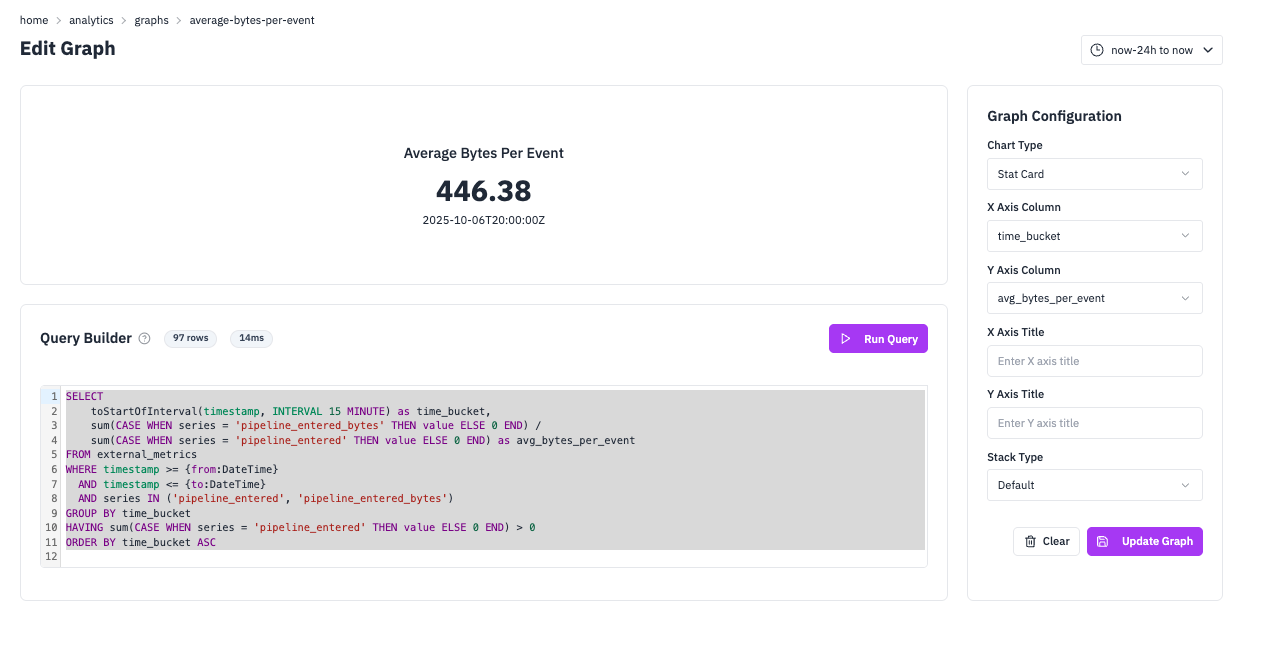
SQL Query
Configuration
Top 10 IPs Per Hour
Column ChartIdentify the most active IP addresses in your network traffic. This query uses window functions to rank IPs by activity within each hour, then filters to show only the top 10. Column charts with stacking are ideal for this because they show both the total volume and the relative contribution of each IP address over time.
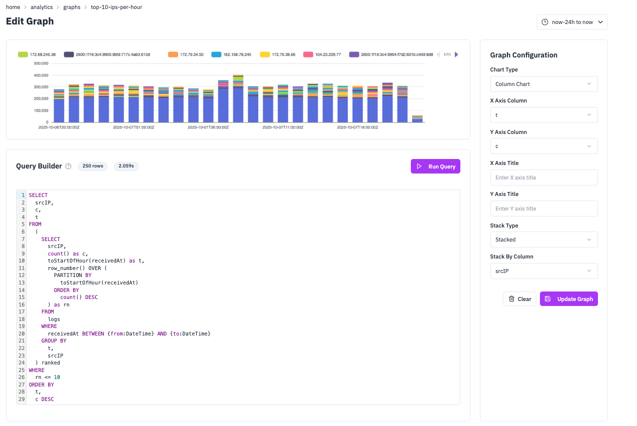
SQL Query
Configuration
Top Events Today
Bar ChartGet a quick overview of the most frequent events in your system over the last 24 hours. This query uses CTEs to first filter recent events, then group and rank them by frequency. Bar charts are perfect for this type of categorical comparison because they make it easy to compare values across different event types and see the relative frequency at a glance.
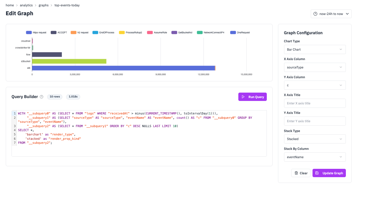
SQL Query
Configuration
Top GCP Events
Column ChartTrack the most frequent Google Cloud Platform events over time to monitor API usage patterns and identify peak activity periods. This query groups events by time buckets and event names, making it easy to see both temporal trends and the relative frequency of different GCP operations. Column charts with stacking are ideal here because they show both the total event volume and the breakdown by event type over time.
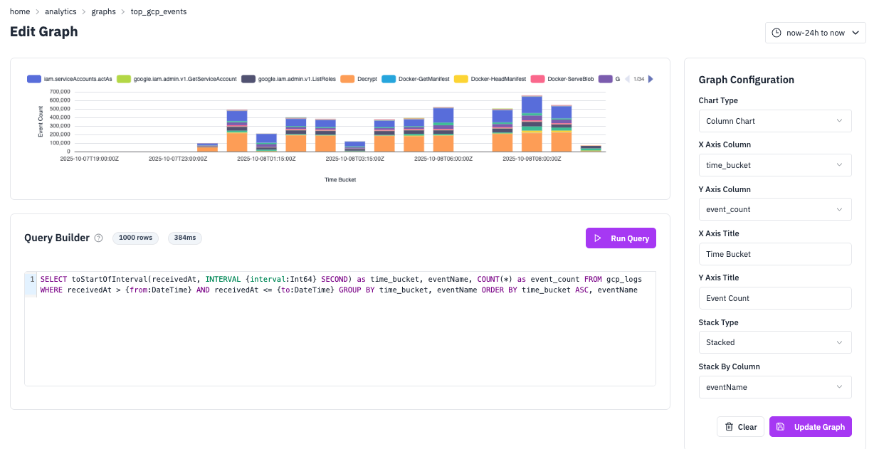
SQL Query
Configuration
Creating Graphs with AI Chat
RunReveal's AI chat makes it easy to create custom graphs using plain English. Simply describe what you want to see and the AI will generate the SQL query and configuration for you.
Template
Use this template to create graphs with natural language:
Example
Here's a real example you can try:
The AI will generate the appropriate SQL query with proper time filtering, grouping, and visualization configuration automatically.
Best Practices
Query Optimization
- Always use time filters — Leverage
{from:DateTime}and{to:DateTime}withBETWEENor>=/<=operators. - Limit result sets — Add
LIMITfor top‑N queries. - Use efficient aggregations — Prefer ClickHouse‑optimized functions:
toStartOfInterval()for time bucketingcountIf()for conditional countingsumIf()for conditional sums
Time Intervals
RunReveal automatically calculates appropriate intervals based on your time range:
Live Features
Real-Time Updates
- Graphs refresh automatically based on your time picker settings.
- Live data updates without manual refresh.
- Consistent data across all panels in a dashboard.
Interactivity
- Hover tooltips — See detailed values on hover.
- Time range selection — Integrated with global time picker.
- Responsive design — Adapts to different screen sizes.